R E A L W E D D I N G - Y A Z M I N & E N I S

B R Y M P T O N H O U S E

As soon as I saw this stunning image of Yazmin I knew this wedding was going to be a pretty one. What specifically touched me, is the attention to detail - I am all about the details. But honestly Yazmin and Enis’s day was one planned to perfection. Every little touch and inclusion was considered. Quite often Brides can look at other weddings with “Oh I wish I’d thought of that” longings, but honestly I’m not sure any stone was left unturned with this stunning wedding. Here are a few of my absolute favourite elements of the day…

Firstly the bridal room at Brympton House is just dreamy and the perfect ‘stage’ for any Bride and her girls to prepare in. This environment, paired with a great photographer such as @ChelseaWhitePhotography results in breath taking, timeless images that are sure to be treasured. The neutral colour scheme will be a fit for anyone, but as if by magic the ornate blue wallpaper coordinates with Yazmin’s beautiful blues eyes, and then the mini charm celebrating Yazmin’s family and Turkish heritage also fits this. It honestly feels like an art director swooped in and styled everything to perfection! The colour scheme throughout the day was a classic black and white and I complete applaud Yazmin & Enis for how they executed this. One example - Yazmin’s stunning bridesmaids also wore white, but a fitted style and a satin look which contrasted her own dress and worked so well. The black and white was also conveyed through the florals with mostly white decadent roses and then the pop of Anemones fully open exposing their black centres were the stars of the show.

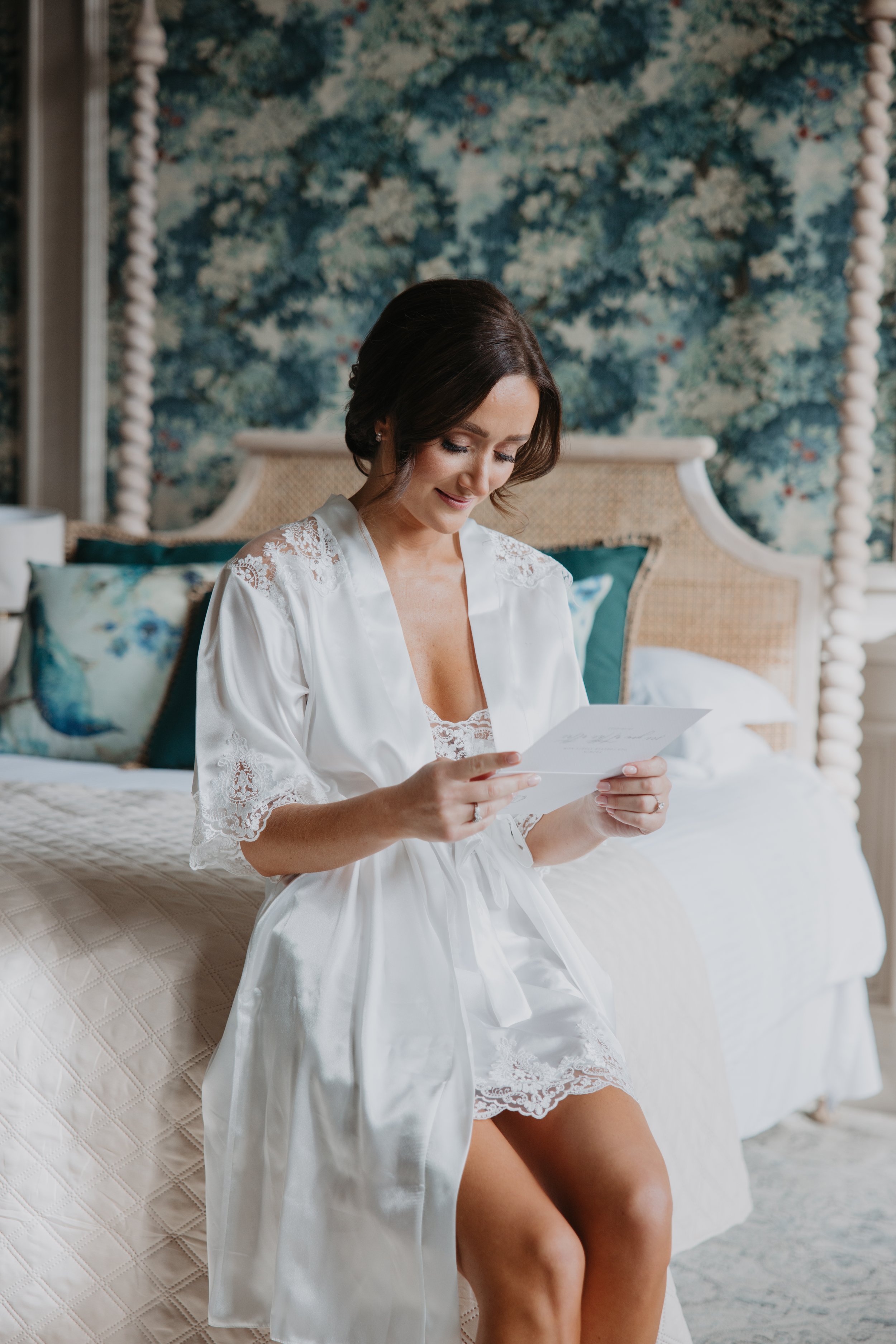
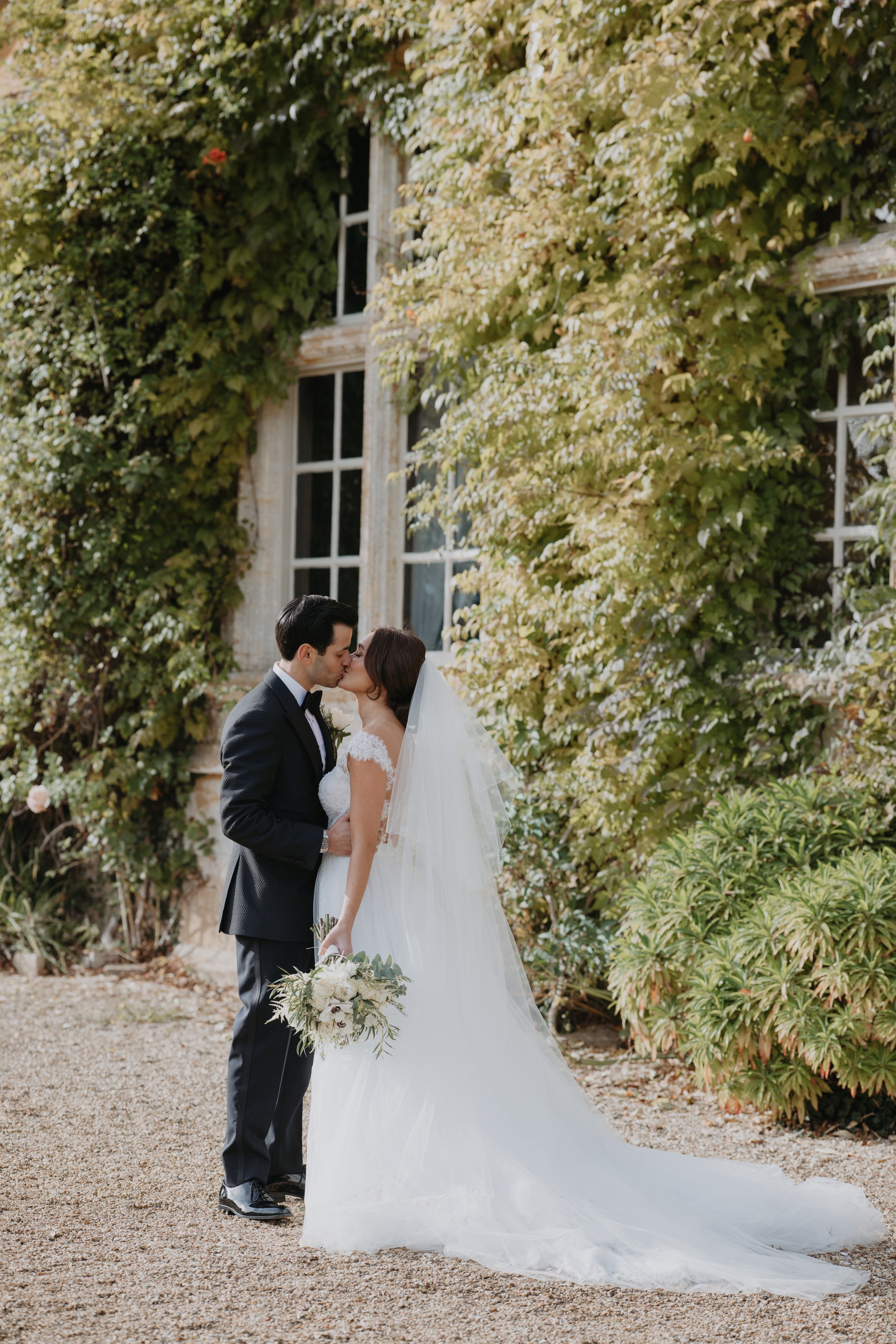
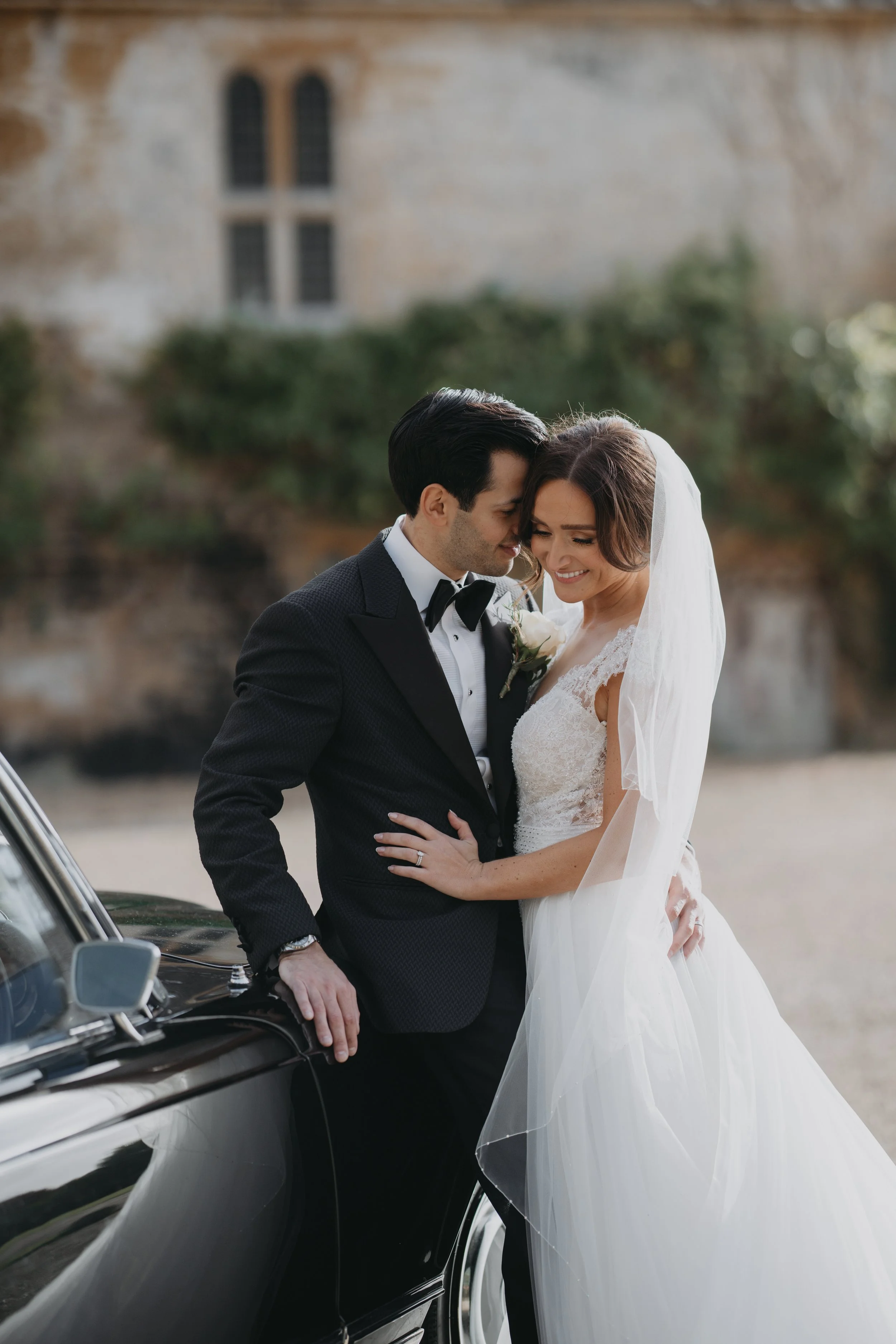
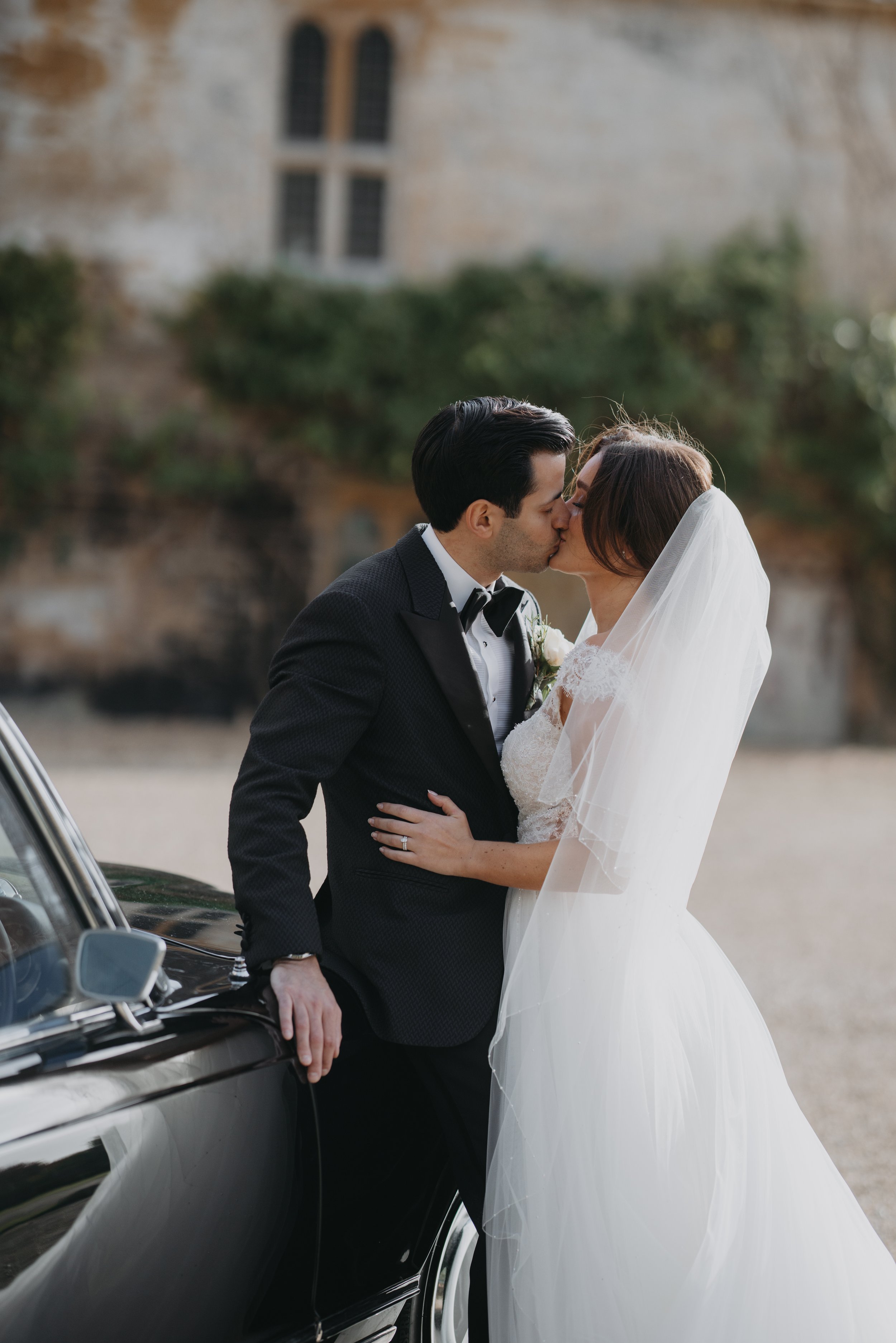
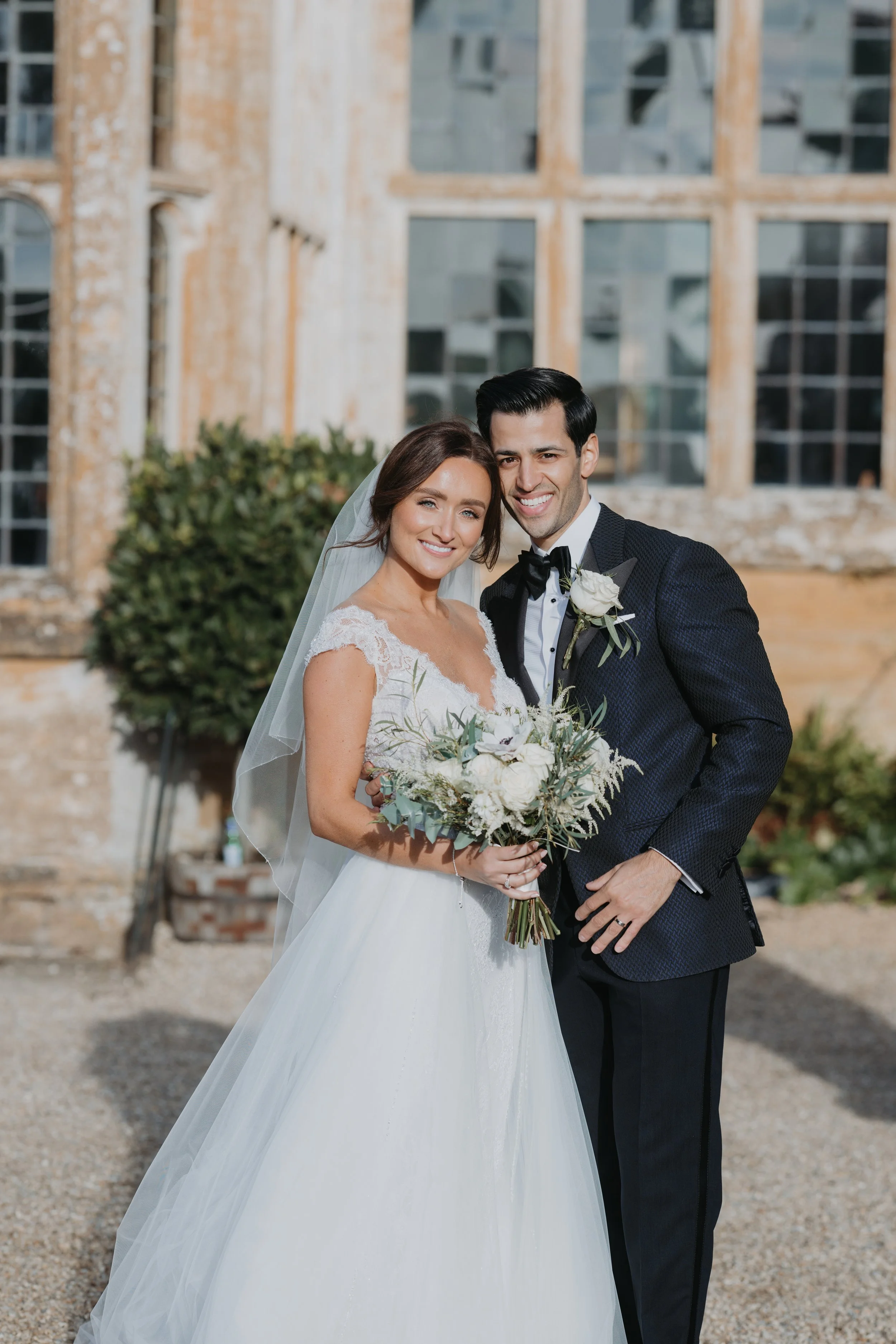
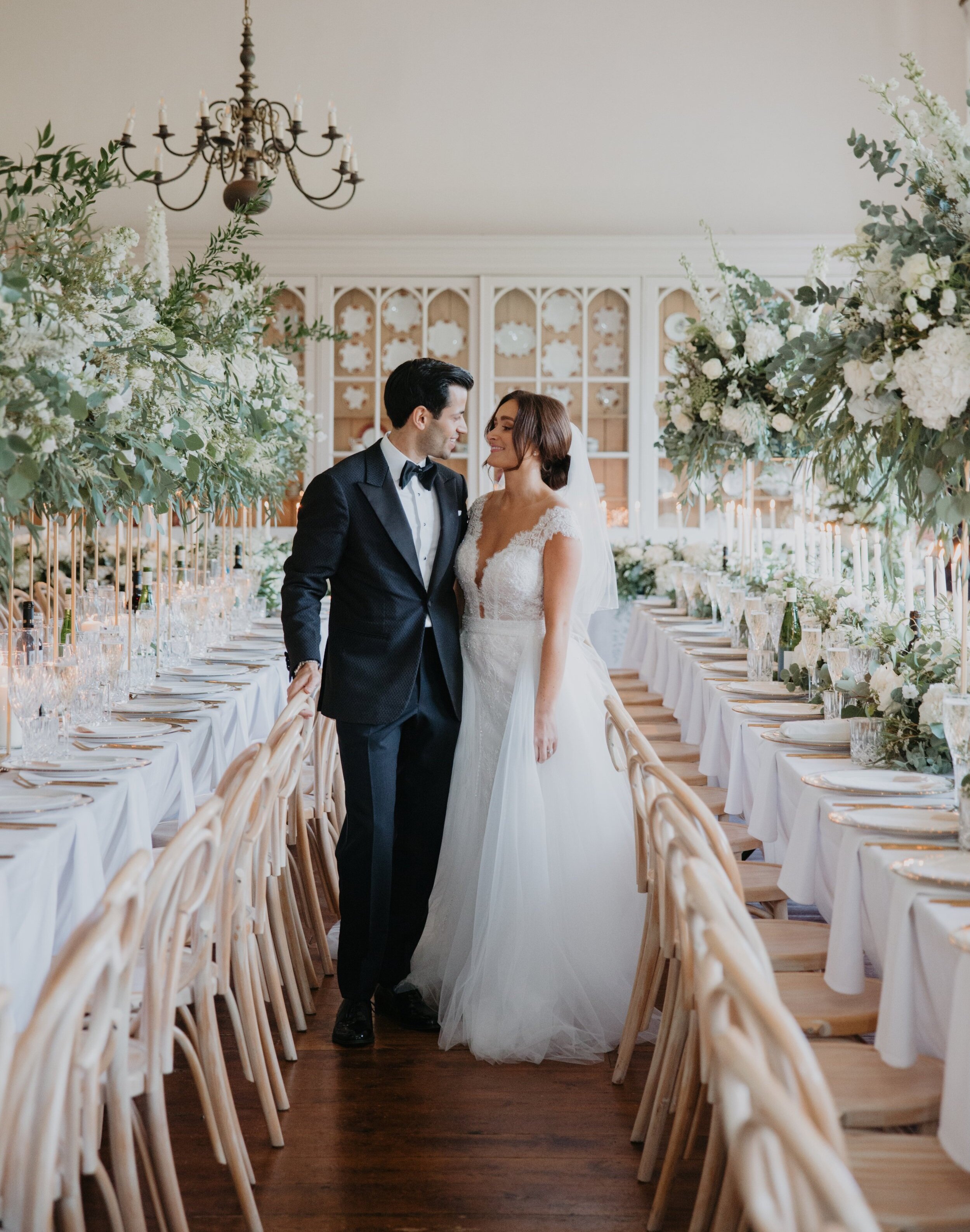
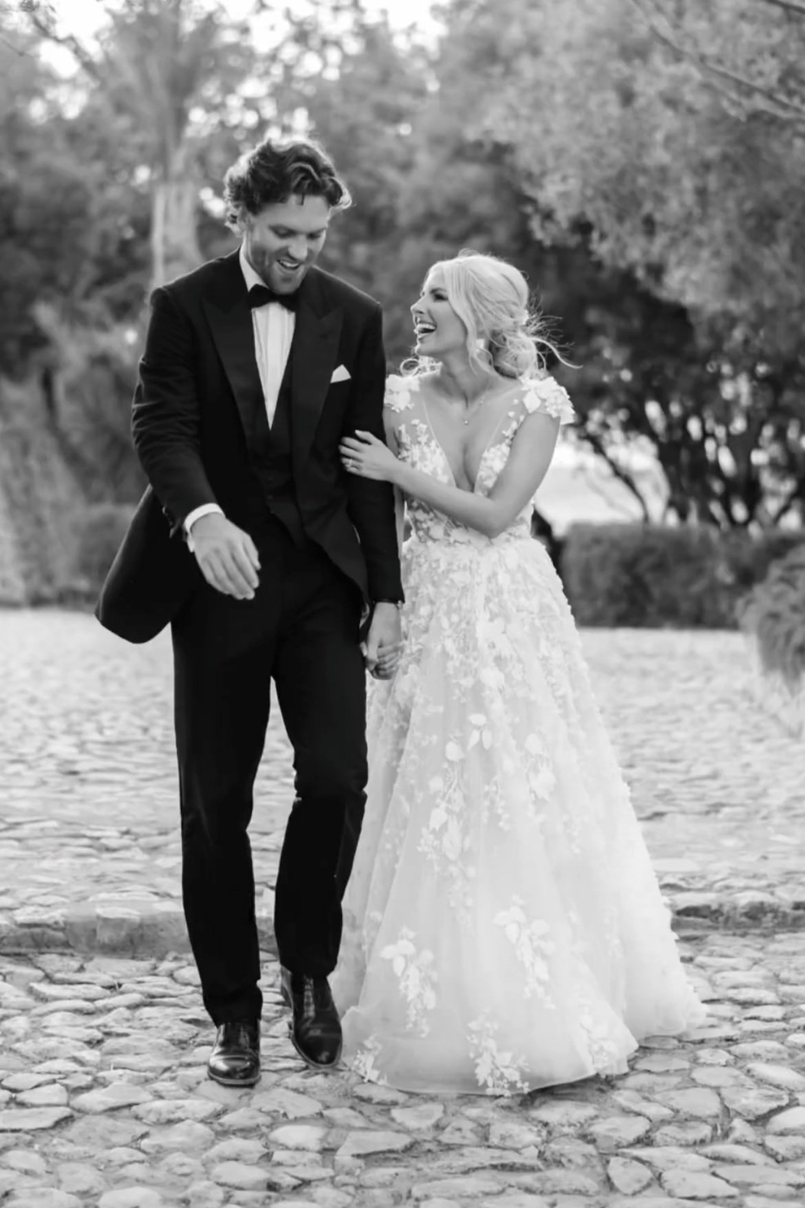
I don’t always get to deal with both the Bride & Groom, let’s be honest its commonly the Bride that deals with stationery and planning etc. It was great to communicate with the lovely couple. These two are so obviously in love, but it’s more than that. They are calm and respectful of others, they see the humour in everything and the way they were with each other felt like they were already married. This is a couple that just function well together, a genuine team where each makes the other better. It honestly was a joy to produce pieces knowing that aspects were chosen by each of them. That certain choices were more one’s decision and then this swapping with the various elements. This was a day they were both excited for, they both worked towards it, planned it and brought to life a cohesive vision - I just know this mindset is the key to a very successful marriage. Not sure you believe me?…see all of the couple portraits for yourselves, I’ve never seen so many kissing pics, it’s enough to make you blush ha!

The stationery produced for Yazmin and Enis matched with the black & white theme. The images not always looking this way as the dye of the hand made paper definitely looks more blue, but honestly this was my first mostly black suite and I loved it. The gold hot foil pressed details are so striking on the black hand made paper, and then we even went one stage further and had white ink printed guest addresses on each envelope, contrast truly was key! These were honestly gorgeous in their piles on my desk and definitely a look I hope to work with again.

The wedding day signage was all produced on acrylic. The smaller pieces for guest book, wishing well etc, were mirrored gold vinyl on clear sheets and the larger pieces such as welcome sign, order of the day and the huge, epic table plan were a combination of white and mirrored gold vinyl on frosted acrylic. They turned out beautifully and when presented on the ornate easels at Brympton House they were picture perfect! I was genuinely in love with how elegant this combination looks and I bet looked stunning in candlelight.

My favourite creation was without doubt the personalised capiz shells. Each guest had a capiz shell place setting awaiting them at their seat. The name in mirrored vinyl adhered by hand to the shell. For longevity each was coated with a clear varnish to be practical as well as pretty keepsakes. These were finished with ivory tassels and placed delicately on the white handmade paper menus with gold hot foil pressed content. A true labour of love! I will never forget the sight of hundreds of these filling the tables in the studio, I was sad to see them go. But they were certainly a feature in a showstopper of a tablescape!! The mostly white room was filled with decadent high floral arrangements by Yazmin’s cousin '@cupid_creative. Huge white hydrangeas were mixed with roses, tiny white buds, eucalyptus and lots of foliage. The romance literally glowing from the chandeliers, the candles in abundance and the shimmering ornate cut glass lining the tables. I bet to walk in to this reception was truly sensational!! This magazine worthy room will be hard to beat, I hope that anyone reading this can take away from it that if you choose a scheme stick with it, see it through in each element and it will produce a classic look. The images and memories created will honestly reflect your diligence and dedication!

I am truly thankful to Yazmin & Enis for allowing me to share some of their images with you. They generously shared the entire gallery with me and I could have written about this day over a few journal posts, it really was that inspiring! Another lovely couple that I will be sad to not see in my inbox anymore, but who I wish only the best for…especially as now huge congratulations are in order as this little family has now grown to three and I am excited to see them grow and thrive!

Bestest wishes

Jacqui

XX

E D I T O R I A L . 1 6

A V I N G T O N P A R K

When Leah of @Leahmariephotography_ reached out to me regarding a collaboration between herself and Pippa of @The_w_collection I was thrilled to read the brief. Firstly it was to be set in the stunning Avington Park, which I couldn’t resist drawing. It has such beautiful ornate details and the symmetry and order of the building and landscape make the illustration a dream for print purposes. With a white and French blue colour scheme and a creative brief that states florals a definite inclusion, it was a pleasure to be involved…And of course how could I not mention there are HalfPenny London dresses!

The day, as any wedding day would, began with bridal prep. The bedroom at Avington Park echoing the colour scheme of the shoot perfectly, even complimenting the darker blues and the gold hues throughout. I always love how a colour so stereotypically perceived as male can prove this wrong and look undoubtedly feminine. The delicacy created by the tiny florals and the sheer bows echo the femininity of this gallery and a perfect example of the magic created when a design brief is so cohesive.

The stationery created for the suite was a culmination of a few projects being created in the studio at the time. The star of the show without a doubt the new mini die cut tags that could adorn not just the invitation suites, but also favours, and menus for example. I couldn’t wait for these to be featured in this editorial and am thrilled with the care that Leah took to capture them so beautifully. The possibilities for how these can be used are endless. This suite was very much created using the Anna’s Blossom collection (for more details please see here.) The delicate Gentle Hermione florals fit perfectly with this design brief as the vellum wrap and liner details. The tablecloth floral is so stunning in this shoot and also features in the cake design. If you love this idea please do allow your suppliers to communicate with each other because it may be that your stationery designer could use the floral too. That way a stunning cohesive vision can be created.

The cake is a stunning piece from the always amazing Anna Lewis @annalewiscakedesign Anna’s pieces are always flawless. The fact that the cake matched other decor elements of the wedding furniture and bar details really made it an additional feature. I really love this idea and hope it increases in popularity.

If bridal portraits are something you are currently researching or ‘pinning’ I hope you will love this assortment from this editorial. Leah has a lovely way of capturing the bride’s joy and the shots with a sense of movement really help convey the excitement and anticipation of the day. When having your bridal portraits taken, don’t be shy in asking for a variety of locations. The range of backgrounds and light will really help you to achieve a library of dreamy images to pic from.

When I viewed the gallery I was instantly wowed by Leah and Pippa’s attention to detail and the way the blue and white theme was used to truly inspire future couples. I also love that two aspirational looks were shown. The first a formal table with decorative tablecloth and abundant floral details, and the second seems like a more intimate gathering arrangement. Set in the orangerie this paired down version creates a more relaxed environment and is perfect for bridal showers, the wedding breakfast for a bride and her girls or even a less formal wedding vibe. Both inspired looks are finished with matching cocktail hour furniture and bar, This is a set up that your guests are sure to remember.

A V I N G T O N P A R K E D I T O R I A L T E A M

Co-Planner & Photographer - @leahmariephotography_

Co-Planner & Styling - @thewstudiostyle

Venue - Avington Park @Avingtonp

Bridal Dresses - @halfpennylondon

Shoes - @bellabelleshoes

Jewellery - @kiriandbelle

Florist - @blueskyflowers

Videographer - @Jacob_and_Pauline

Make up artist - @sylwiakunyszmua

Hair stylist - @id_makeup_hair_beauty

Stationery - @Peoniesandpaperclips.uk

Cake Designer - @Annalewiscakedesign

Furniture & Bar - @the _w_collection

Tableware - @neptunechichester

Napkins - @theknottednapkinco

Cocktails - @thedrunkenjockeys

Models - @anabeardsworth @kelly_whiteside @sophiathorogood @claudiaostlers @kieraashley_

R E A L W E D D I N G - R U B Y & S A M

F I N C A S E R E N A , M A L L O R C A

Ruby & Sam married in the vineyards of Finca Serena, Mallorca. Surrounded by family, friends and the most idyllic views of Olive groves. Hence the Olive illustration within the set and the creation of a new Peonies & Paperclips collection. I will be forever thankful that Ruby & Sam found me to design and produce their pieces and also that Ruby loved the idea of a full colour illustration of an olive branch which led to a key element of the suite. I worked with Ruby over a two year period from the Save the Dates through to wedding day stationery pieces. The weddings that I get to do that with are always so special to me as the relationship created over that time surpasses a mere supplier and the excitement to see a wedding planned for that length of time is real! I cannot wait to see the day come together. And this one was truly beautiful!! I am thrilled to be able to share some images of this stunning day with you - if your aesthetic is for a Mediterranean feel you will want to save this journal entry I promise!

Like many couples that marry abroad Ruby & Sam had events planned over a three day period - The welcome dinner, the wedding and then a pool party the next day. The itinerary and further details, along with a welcome note from the happy couple were collated into this little tri-fold welcome card which I designed also to include a map on the reverse. They were waiting for each guest in their rooms, a sweet little reminder of events to have to hand and a cute keepsake of the entire event.

This first set of images are from the Welcome dinner the night before, it looks idyllic not only because of the setting, but the wardrobe choices!! They are just wow!! It makes me want a re-do and then numerous outfit changes throughout. Ruby’s stunning welcome dinner dress is by @christienicole_bridal finished with the cutest shoes by @loefflerrandall and jewellery by @mejuri. Sam looking very handsome in @massimodutti. Photographer of the wedding events the very talented @mariahibbsphotography. I’m certain any guest at this ‘night before’ must have had extra excitement for the wedding day after seeing how beautiful this lovely couple looked.

I hope that this first impression of the wedding was an echo of the excitement each guest would have had when receiving Ruby & Sam’s wedding stationery pieces. After all the Save the Dates, or your wedding invitations are the first glimpse of what your guests have in store. The suite created exudes Mediterranean vibes, warm summer evenings and dreamy landscapes. The handmade paper and silk ribbons used throughout add texture and a tactile element to the set and the gold hot foil pressed details on each piece convey luxury and elegance. This is an event not to be missed!

Beautiful flatlay of some of the suite content captured by @DavidCPhotography.

Ruby’s gorgeous dress is a Berta design from @theweddingclubofficial, worn with accessories from @megantheresecouture. Keeping with the white palette, Ruby’s bridesmaids also wore white, with matching dresses from @chichiclothing. As you can see in this absolutely stunning image taken by @mariahibbsphotography the overall look is so elegant and timeless. I honestly think this is my favourite ever image of a Bride with her ladies. By carrying the colour palette all the way through the attire, decor and stationery the outcome is such a classic one, proving time and time again that less is more.

For Ruby & Sam’s wedding stationery the same materials were carried through all the paper pretties. The Save The Dates were handmade paper sheets with cotton envelopes and the gold hot foil pressed details really shone. Paired with a bespoke initial wax seal for an elegant finishing embellishment. The Invitation suite not only saw a change in scale for the invitation card, but also the inclusion of the venue illustration and a blind embossed border. This meant that when the save the dates and the invitation cards were placed together, although both using the same papers, foil and text, the outcomes were different and complimented each other beautifully. The invitation card was paired with a further information sheet, one of which had different coloured foil pressed content, the other was a hand painted watercolour wash, digitally printed and then finished with a gold hot foil pressed header. Again side by side the two cards really sat well together. The RSVP was to be handmade paper but to add a touch of interest I hand dyed each sheet, not only to introduce more green in a delicate way but also to echo the watercolour wash of the information card. When layered and bound by the the full colour digital print vellum wrap, the sage green silk ribbon and old world charm - hand poured bespoke wax seal the finished bundles are stunning! A joy for any guest to receive. Images of stationery below captured by Peonies & Paperclips. For more details on this collection and to see how others have used it please see here.

With so many stunning images to pick from I could have shown so much more, but it isn’t my story to fully tell is it! It’s both Ruby & Sam’s and if you would like further details and information please do view Ruby’s YouTube channel, or of course her Instagram @rubyholley where Ruby is such a sweetheart and has collated a highlight folder with all the common questions and answers. My hope is that you will use this as inspiration and produce your own take on either a Mediterranean based wedding, or of course the elegant colour palette. My constant wish for my couples is that your day is filled with as much love and happiness as these images…

The sheer joy of the day radiates through every smile in these images. Whether it’s the Bride, Groom, bridesmaids or other guests, this was a wedding full of love and thoughtful touches. The colour scheme of white, pale sage green and gold can be seen in many ways, the wedding reception table decor, the florals and foliage and also the outfits worn by the wedding party and nearest and dearest. I may be bias because this was also my own wedding’s colour scheme, but truthfully it really is such a classic and timeless look that will be just as elegant when the grandchildren view these images as it is now.