R E A L W E D D I N G - R U B Y & S A M

F I N C A S E R E N A , M A L L O R C A

Ruby & Sam married in the vineyards of Finca Serena, Mallorca. Surrounded by family, friends and the most idyllic views of Olive groves. Hence the Olive illustration within the set and the creation of a new Peonies & Paperclips collection. I will be forever thankful that Ruby & Sam found me to design and produce their pieces and also that Ruby loved the idea of a full colour illustration of an olive branch which led to a key element of the suite. I worked with Ruby over a two year period from the Save the Dates through to wedding day stationery pieces. The weddings that I get to do that with are always so special to me as the relationship created over that time surpasses a mere supplier and the excitement to see a wedding planned for that length of time is real! I cannot wait to see the day come together. And this one was truly beautiful!! I am thrilled to be able to share some images of this stunning day with you - if your aesthetic is for a Mediterranean feel you will want to save this journal entry I promise!

Like many couples that marry abroad Ruby & Sam had events planned over a three day period - The welcome dinner, the wedding and then a pool party the next day. The itinerary and further details, along with a welcome note from the happy couple were collated into this little tri-fold welcome card which I designed also to include a map on the reverse. They were waiting for each guest in their rooms, a sweet little reminder of events to have to hand and a cute keepsake of the entire event.

This first set of images are from the Welcome dinner the night before, it looks idyllic not only because of the setting, but the wardrobe choices!! They are just wow!! It makes me want a re-do and then numerous outfit changes throughout. Ruby’s stunning welcome dinner dress is by @christienicole_bridal finished with the cutest shoes by @loefflerrandall and jewellery by @mejuri. Sam looking very handsome in @massimodutti. Photographer of the wedding events the very talented @mariahibbsphotography. I’m certain any guest at this ‘night before’ must have had extra excitement for the wedding day after seeing how beautiful this lovely couple looked.

I hope that this first impression of the wedding was an echo of the excitement each guest would have had when receiving Ruby & Sam’s wedding stationery pieces. After all the Save the Dates, or your wedding invitations are the first glimpse of what your guests have in store. The suite created exudes Mediterranean vibes, warm summer evenings and dreamy landscapes. The handmade paper and silk ribbons used throughout add texture and a tactile element to the set and the gold hot foil pressed details on each piece convey luxury and elegance. This is an event not to be missed!

Beautiful flatlay of some of the suite content captured by @DavidCPhotography.

Ruby’s gorgeous dress is a Berta design from @theweddingclubofficial, worn with accessories from @megantheresecouture. Keeping with the white palette, Ruby’s bridesmaids also wore white, with matching dresses from @chichiclothing. As you can see in this absolutely stunning image taken by @mariahibbsphotography the overall look is so elegant and timeless. I honestly think this is my favourite ever image of a Bride with her ladies. By carrying the colour palette all the way through the attire, decor and stationery the outcome is such a classic one, proving time and time again that less is more.

For Ruby & Sam’s wedding stationery the same materials were carried through all the paper pretties. The Save The Dates were handmade paper sheets with cotton envelopes and the gold hot foil pressed details really shone. Paired with a bespoke initial wax seal for an elegant finishing embellishment. The Invitation suite not only saw a change in scale for the invitation card, but also the inclusion of the venue illustration and a blind embossed border. This meant that when the save the dates and the invitation cards were placed together, although both using the same papers, foil and text, the outcomes were different and complimented each other beautifully. The invitation card was paired with a further information sheet, one of which had different coloured foil pressed content, the other was a hand painted watercolour wash, digitally printed and then finished with a gold hot foil pressed header. Again side by side the two cards really sat well together. The RSVP was to be handmade paper but to add a touch of interest I hand dyed each sheet, not only to introduce more green in a delicate way but also to echo the watercolour wash of the information card. When layered and bound by the the full colour digital print vellum wrap, the sage green silk ribbon and old world charm - hand poured bespoke wax seal the finished bundles are stunning! A joy for any guest to receive. Images of stationery below captured by Peonies & Paperclips. For more details on this collection and to see how others have used it please see here.

With so many stunning images to pick from I could have shown so much more, but it isn’t my story to fully tell is it! It’s both Ruby & Sam’s and if you would like further details and information please do view Ruby’s YouTube channel, or of course her Instagram @rubyholley where Ruby is such a sweetheart and has collated a highlight folder with all the common questions and answers. My hope is that you will use this as inspiration and produce your own take on either a Mediterranean based wedding, or of course the elegant colour palette. My constant wish for my couples is that your day is filled with as much love and happiness as these images…

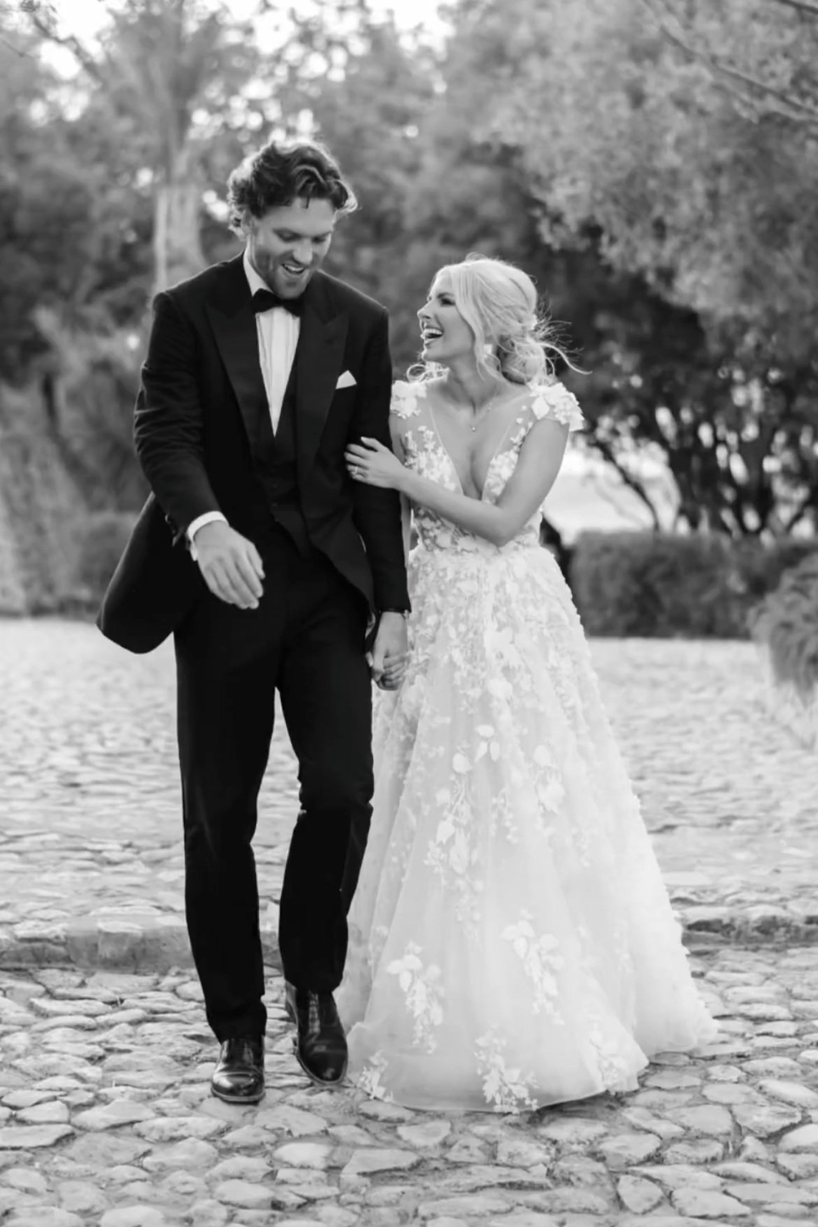
The sheer joy of the day radiates through every smile in these images. Whether it’s the Bride, Groom, bridesmaids or other guests, this was a wedding full of love and thoughtful touches. The colour scheme of white, pale sage green and gold can be seen in many ways, the wedding reception table decor, the florals and foliage and also the outfits worn by the wedding party and nearest and dearest. I may be bias because this was also my own wedding’s colour scheme, but truthfully it really is such a classic and timeless look that will be just as elegant when the grandchildren view these images as it is now.